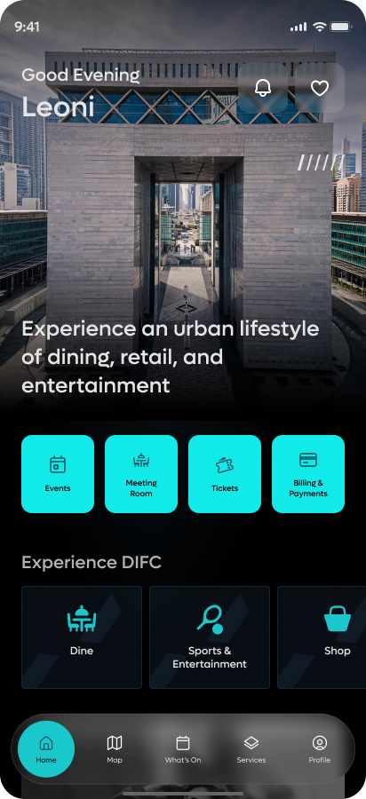
Three products, 40+ services, one consistent DIFC+ experience
ProblemDIFC+ was growing into three products, and 40+ services had to feel like one app.
What I didBuilt the design tokens and component library, the information architecture, and the high-fidelity UI for the DIFC+ dashboard and Tenex.
ResultClient-approved and shipped: 3 pillars, 100+ screens each, on one system of 260+ tokens.
Role
Product & motion designer
Client
DIFC
Agency
Magure INC
Timeline
Apr 25 – Jun 26
Team
3 designers · PMs · CTO
Overview
An all-in-one app for everyone inside DIFC, Dubai's financial district: employees, guests and students. They find services, get around and grab perks without switching between five different apps.
DIFC+ was expanding across three product areas at once: the core DIFC+ app, Tenex, and property management.
What I owned
Created the design tokens and component library from the DIFC brand guidelines.
Developed the information architecture and wireframes, with reviews from Nitin.
Designed the high-fidelity UI for the DIFC+ dashboard and Tenex.
Guided the junior UI designer through end-of-project bug fixes, alongside Nitin.
Established the design foundation that was reused for Property Management.
Who else was involved
Nitin Prajapati · Lead Designer
Reviewed my wireframes and information architecture before stakeholder presentations, and owned the Property Management design using the system I created.
Junior UI Designer · Joined near the end
Resolved UI bugs under Nitin's and my guidance.
Product Managers & CTO · Requirements
Provided business and product requirements through the BRD and discussions, and reviewed the proposed information architecture and wireframes.
Problem
DIFC+ was expanding across three product areas: the core DIFC+ app, Tenex, and property management. The challenge was to translate business requirements and complex service workflows into a consistent, usable product experience.
I identified the key design challenges by reviewing the BRD and discussing requirements, technical constraints and product expectations with the Product Managers and CTO. Those conversations showed me the different user roles, the workflows each one needed, and how complex it would be to bring multiple services into one cohesive ecosystem.
From there, the focus was on structuring the experience, designing the workflows, and establishing a reusable design system that could support the product as it expanded.
Constraints
Three audiences with different reasons to open the same app.
One design system that had to hold up in both light and dark.
A financial district trying to feel like a lifestyle brand.
Requirements arrived as a BRD: complex service workflows that had to become usable flows.
Several user roles, each with its own required workflows.
Key decisions
Each card shows what I chose. Flip it to see the option I rejected, and why.
Previewing uploaded documents
Decision 01
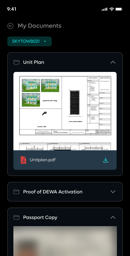
The property flow asked users to upload a long list of documents: unit plan, DEWA and EMPOWER activation proofs, Emirates ID, passport copy. With that many, it's easy to lose track of what's been uploaded, and whether it's the right file.
CHOSEN
A smart accordion for each document type that opens to a large preview of the uploaded file.
Why: In a process this long, seeing the actual document is what removes the doubt. The accordion keeps the page short, but one tap shows enough of the file to confirm it's the right one.
REJECTED not shipped
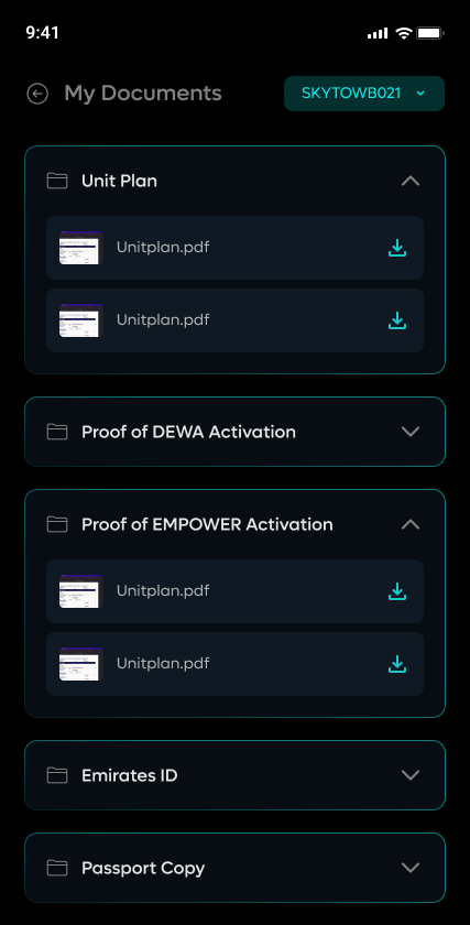
A document list with a small file thumbnail next to each upload.
Why not: The thumbnails were too small to tell whether the right document had been uploaded, which brought back exactly the confusion the page was meant to remove.
Moving around the co-working dashboard
Decision 02
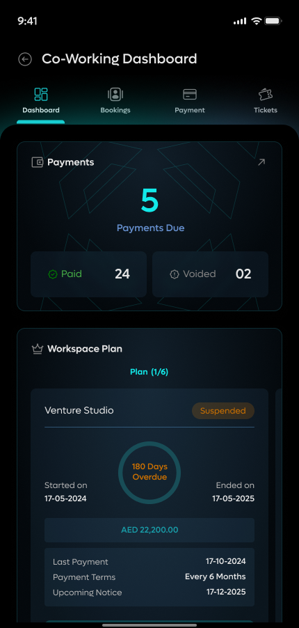
Co-working is one service inside DIFC+, with its own dashboard for bookings, payments and tickets. Members move between these constantly, and the app already has a main dashboard above it.
CHOSEN
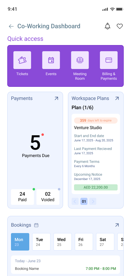
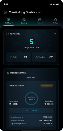
One co-working space with a tab bar (Dashboard, Bookings, Payment, Tickets) that members can tap or swipe between.
Why: Everything stays inside a single interface, and you always see where you are. The flow feels connected, and there's less to hold in your head.
REJECTED not shipped
A quick-access grid of icons, each redirecting to its own separate page.
Why not: Jumping out to independent pages felt broken rather than connected. With the main DIFC+ dashboard already above it, a second dashboard of redirects would have interrupted the flow and added to the cognitive load.
Process
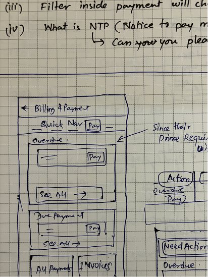
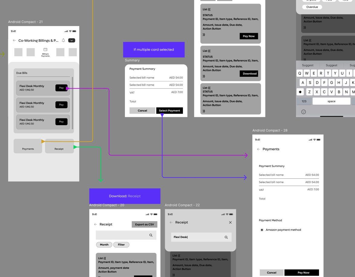
Each service started on paper, moved into wireframes that Nitin, the PMs and the CTO reviewed, then went to high fidelity on the design system. Here's one thread, co-working billing and payments, followed all the way through.
01 · SketchBilling & payments, on paper02 · WireframesThe pay, summary and receipt flows03 · FinalPayments on the co-working dashboard
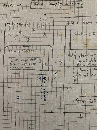
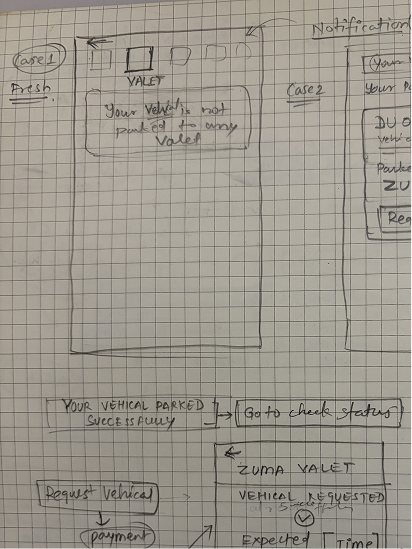
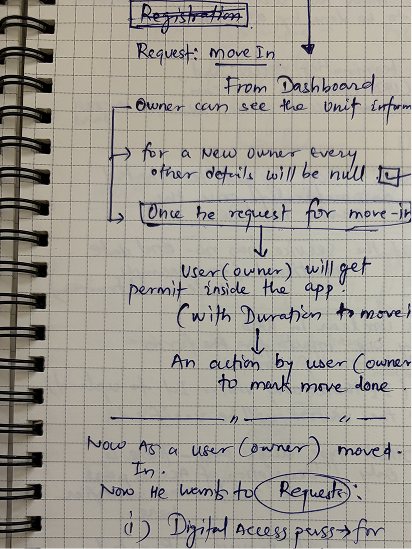
More from the sketchbook
EV charging stationsValet parkingMove-in request flow
Motion icons
I also designed the motion icons for DIFC+ services. Small details, but they're the first thing that makes an app feel alive.
Outcome
The design was approved by the client and shipped. The foundation I built became the base for Property Management, the third pillar, which Nitin designed on top of my system.
40+services in one app
3product pillars
100+screens per pillar
120+primitive tokens
140+aliased tokens
Reflections
One app, three different people using it for three different reasons.
A design system had to hold up in both light and dark, not just look good in one.
Motion icons, small details, but they're the first thing that makes an app feel alive.