

A Practical Guide to Automating Design Tokens with AI (Without Losing Control of the System)
I design things for a living. I also, increasingly, direct AI to build things for a living. This is about the point where those two jobs overlapped in a way worth writing down: teaching an AI the actual rules of a design token system, and watching it build (and maintain) one, inside a real Figma file, at a scale no single person keeps consistent by hand for long.
If you're a designer who wants to try this yourself, this is the how. If you're trying to understand how I work, this is the thinking.
Heads up: this system is still a work in progress (v1.4), so use it wisely. Read the index first, and check what it builds rather than trusting it blindly.
- Connect Figma to your AI tool through Figma's official MCP server (you sign in to Figma once). Claude app: Settings → Connectors → Figma. Claude Code: run
claude plugin install figma@claude-plugins-official. Cursor: type/add-plugin figmain the agent chat, then connect it under Settings → Tools & MCP. - Give it the rules. Attach the five files below (or drop the unzipped folder into your project) and ask it to read
00-INDEX.mdfirst. - Point it at your file. Paste your Figma file link, give it your real brand colors and spacing, and ask it to build the variables following the rules, starting with primitives.
Every design system eventually drifts. Someone picks a blue that's close enough. A corner radius gets typed in by hand instead of pulled from the scale. Six months in, nobody can say with confidence what "the" primary blue even is anymore. There are four of them, scattered across components, all slightly different, all technically "fine."
The standard fix is a token system: one place that defines every raw value, one layer that gives those values meaning, and components that only ever borrow meaning, never raw values directly. It's not a new idea. What's new is that an AI can now build and maintain the whole thing inside your actual design file, as real, live variables, not a spec document someone has to remember to update.
The hard part was never getting an AI to generate colors. It was getting it to follow a system strictly enough that the result was actually trustworthy: not generating something that looked done, but something that was structurally correct down to the last variable.
Before I let AI touch anything, I wrote the rules down. Not a prompt, an actual rulebook, in plain markdown, that any session (or any designer) could read cold and apply the same way every time.
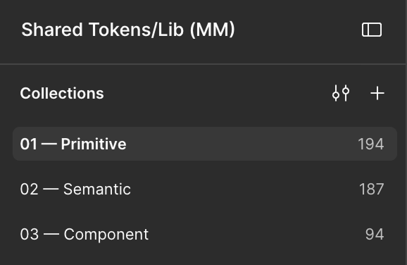
Tier 1: Primitives. Raw values only. A hex code. A number. Nothing here knows what it's for, and nothing here is allowed to reference anything else. blue/500 = #2563EB. That's it. The only real requirement: build a complete scale, never an isolated value. One blue on its own is a liability; a full 50–950 ramp is a system.
Tier 2: Semantic. This is where meaning gets introduced. A primitive gets assigned a role: color/text/primary, color/background/surface, spacing/inset/md. Every semantic token must alias a primitive and never contain a raw value itself, with one narrow exception: a value that genuinely can't be represented by the primitive scale (a scrim needing a specific alpha, say) is allowed, but only if it's documented with a reason. Undocumented exceptions aren't allowed. Ever.
Tier 3: Component. The implementation layer. button/primary/bg, input/border/focus. Every component token aliases a semantic token. Never a primitive, never a raw value. And critically: you don't create a component token just because a component exists. You create one only once three or more components would otherwise share the same semantic token but actually need to diverge from each other. Until then, components just consume the semantic layer directly. This single rule prevents the token system from exploding into hundreds of near-duplicate component-level tokens that exist for no real reason.
The one rule underneath all three: references only ever flow downward. Component → Semantic → Primitive. Never sideways, never skipped, never circular. If a component token is pointing straight at a raw hex value, that's not a shortcut. It's a bug, full stop. This single constraint is what makes the whole system reliable enough to automate. An AI can't quietly take a shortcut if "no shortcuts" is a structural rule, not a style preference.
There's a longer version of these rules: platform export requirements, how to handle values that genuinely differ between iOS and Android, a glossary, a worked example tracing one token end to end. But those three tiers and that one downward-only rule are the whole spine of it.
Here's the actual workflow. I didn't ask the AI to design anything. I gave it the rulebook first, then the real inputs (actual brand colors, actual spacing needs), and asked it to build the real thing: live variables inside the actual design file, correctly scoped, with platform-specific export names already attached, not a mockup of what the system would look like.
This matters more than it sounds like it should. A screenshot of a nice color palette proves nothing about whether the underlying system is sound. Live variables, correctly tiered, with every alias chain intact: that's the thing that actually prevents drift six months from now.
The valuable part wasn't the generation. Plenty of tools generate a palette. The valuable part was watching it recognize the edges of its own knowledge and stop.
It flagged a real gap instead of papering over it. I'd given it a small handful of neutral colors, enough for a light theme. When I asked for a dark theme too, it pointed out that I'd only given it one color dark enough to use as a background, and that if it reused that single color for every dark-mode surface, a card and its background and a "disabled" state would all be visually identical. It laid out the honest options (invent a couple of additional dark shades and say so explicitly, or wait for more input) instead of quietly picking one and moving on.
It refused to invent numbers. When the system needed a spacing scale and a corner-radius scale I hadn't actually specified, it didn't just make something up to look complete. It proposed a clearly labeled, sensible default and asked me to confirm or override it with real values, every time, not just once. That's the difference between a system that's actually consistent and one that just looks consistent in the file you happen to be looking at today.
It caught a conflict between old and new rules. Partway through, I updated the rulebook itself: a handful of naming conventions changed. Instead of quietly building on top of the old version, it compared the two versions, found the exact points of disagreement, and asked whether I wanted the differences patched in place or the system rebuilt clean. Silent migration is exactly how systems end up half-old, half-new, and fully confusing.
It audited itself honestly. When I later asked it to document the whole system, it didn't describe what it remembered building. It went back into the live file and counted what was actually there, and found one stray value that hadn't come from any of our sessions. It told me plainly, rather than folding it quietly into the write-up.
None of that is the AI being clever. It's the AI being correctly constrained, because the rules it was given left no room for silent judgment calls on anything that genuinely mattered.
If you want to try this on a real project, here's the order that worked:
1. Write your own rulebook before you touch a single color. Three tiers, one downward-only rule, explicit naming conventions. It doesn't need to be long. It needs to be unambiguous.
2. Only give the AI real inputs. Your actual brand colors, your actual spacing needs, not placeholders "to get started." Every placeholder becomes a real value in the output if you're not careful, and now it's load-bearing.
3. Build in a stopping point for genuine ambiguity. Tell it explicitly: when a value is missing or two valid answers exist, stop and ask. Don't guess and keep moving. This is the single highest-leverage instruction in the whole process.
4. Primitives and semantics first, always. Don't let it anywhere near component-level tokens until the foundation is complete and validated. Component tokens are the layer most likely to go wrong if the foundation underneath them is shaky.
5. Only add component tokens when real reuse demands it. Resist the urge to pre-build a token for every component that might exist someday. Let genuine divergence between three or more real components justify each one.
6. Treat generated documentation as a snapshot, not a dashboard. A documentation page built by reading the live file is accurate the moment it's built, and starts going stale the moment anyone changes a variable by hand. Re-generate it on demand; don't treat it as self-updating magic.
This isn't a story about replacing design judgment with AI. The judgment stayed entirely human: what should dark mode feel like, what's the right spacing scale, do we migrate or rebuild. What got automated was the part that was always tedious and always where consistency quietly died: keeping hundreds of small values honestly in sync with a written system, every single time, without getting tired around decision one hundred and fifty.
That's the actual skill on display here: not "knows how to prompt an AI," but knows how to write a system precise enough that an AI (or a junior designer, or anyone) can execute it faithfully at a scale a single person can't sustain by hand. For a project big enough to need real consistency across dozens of screens and multiple platforms, that's the difference between a design system that holds up and one that quietly doesn't.